Improving the usability of a sleep-tracking feature through usability research
ROLE
Product Designer
TIMELINE
Nov - Dec 2025
TEAM
4 Designers
SKILLS
Product Design
UX Research
Usability testing
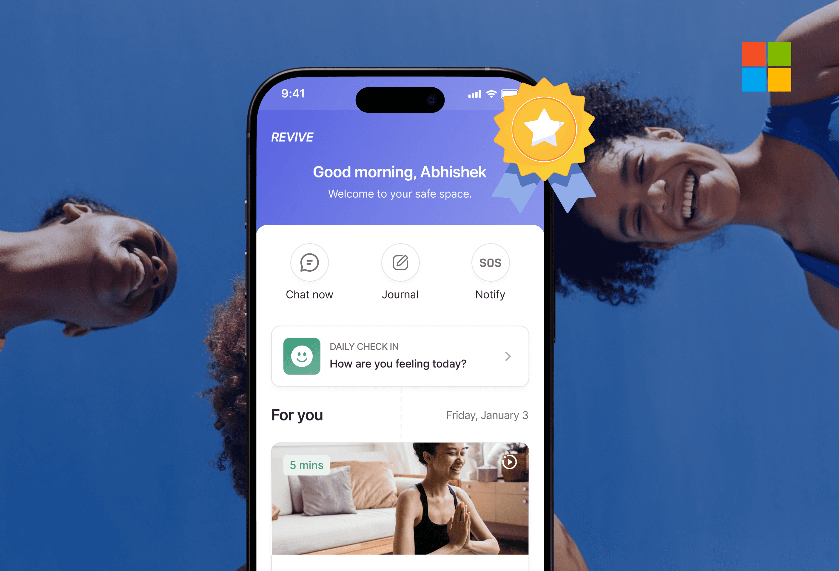
HESITATION
The sleep feature was new. The path forward wasn’t immediately clear.
This initial moment of pause highlighted the importance of evaluating how users approach and make sense of the Sleep experience.
While the feature introduced valuable wellness data, its effectiveness depended on how clearly users could engage with it from the start.

“I’m not sure what I should be looking at first.”
This observation became the starting point for a broader usability study.
CLIENT PERSPECTIVE
Super Veggie wanted to validate the sleep experience before scaling it further.
As SuperVeggie expanded beyond meal delivery into wellness tracking, the team needed to understand how the new Sleep feature performed in real use.
Their goal was to identify usability gaps early, ensure the experience met user expectations, and gather evidence-based recommendations before committing to further product investment.
FOCUS
What we set out to learn
SuperVeggie wanted clarity on whether users could navigate the features without guidance, make sense of the information presented, and feel supported as they moved through the experience.
Clarity of the experience?
Can users understand what the Sleep feature offers and what info matters most?
Ease of use?
How smoothly can users move through key Sleep and meal ordering flows without guidance?
Confidence to continue?
Do users feel supported enough to keep using the feature over time?
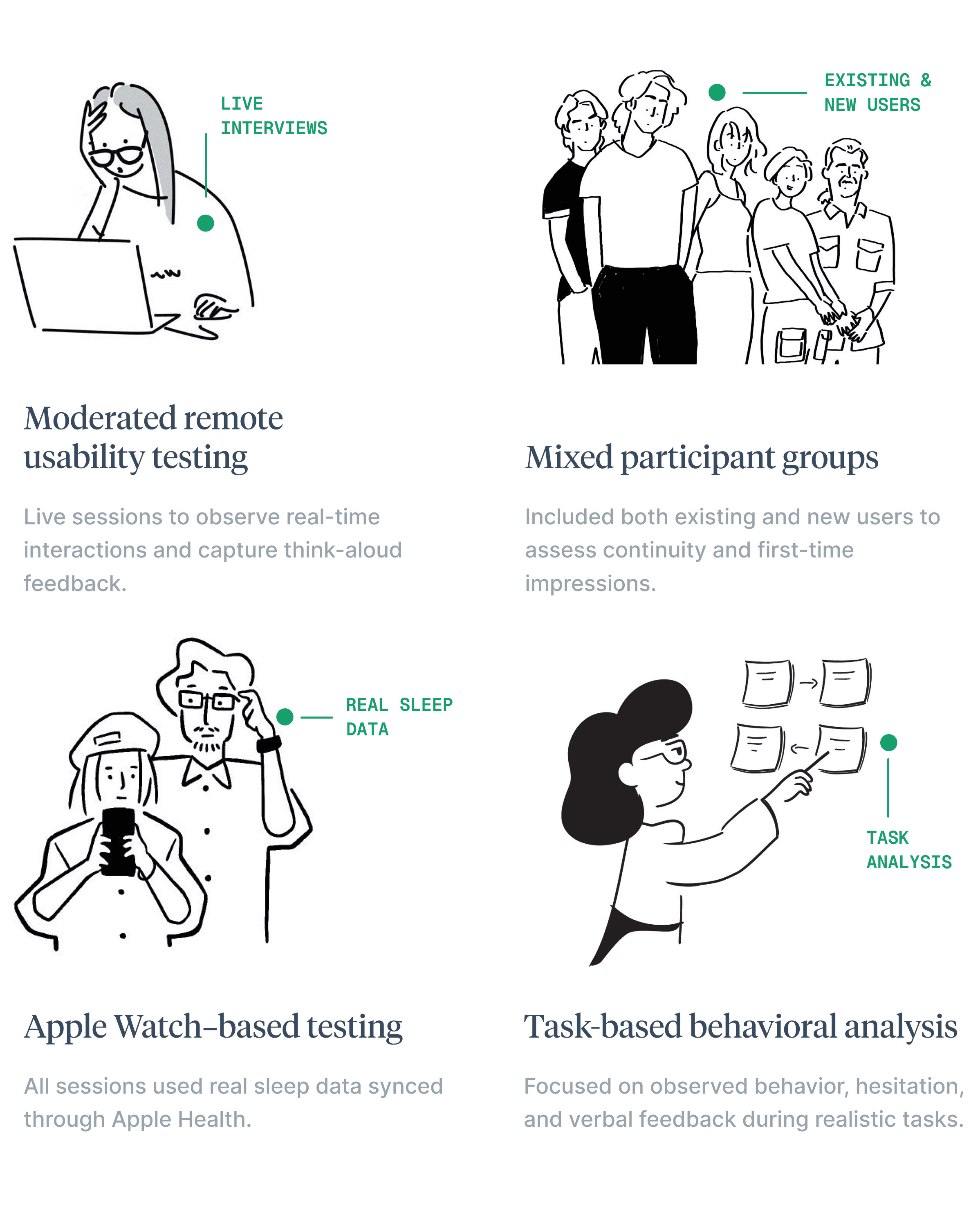
METHODOLOGY
How we studied the experience
SuperVeggie wanted to understand how users experienced the Sleep feature in real use, while also evaluating key moments in the meal ordering flow.


USABILITY INSIGHTS
Where users struggled and what we changed
SuperVeggie wanted to understand how users experienced the Sleep feature in real use, while also evaluating key moments in the meal ordering flow.
Testing revealed that users struggled most when effort or interpretation was required before value was clear. Across both sleep and meal flows, moments of uncertainty led to hesitation, misinterpretation, or abandonment.
PROBLEM 1
Sleep survey felt heavy and discouraging upfront
The survey opened with dense explanations and a long, single-scroll form.
Users felt the effort before seeing value and didn’t realize it could be skipped.
EXPLORED SOLUTION
Reduce upfront effort and make progress visible
We simplified the survey entry, surfaced only what users needed to start, and made progress and skip options visible from the beginning.

By setting expectations early and lowering the entry barrier, users felt more comfortable starting the survey instead of postponing it.
PROBLEM 2
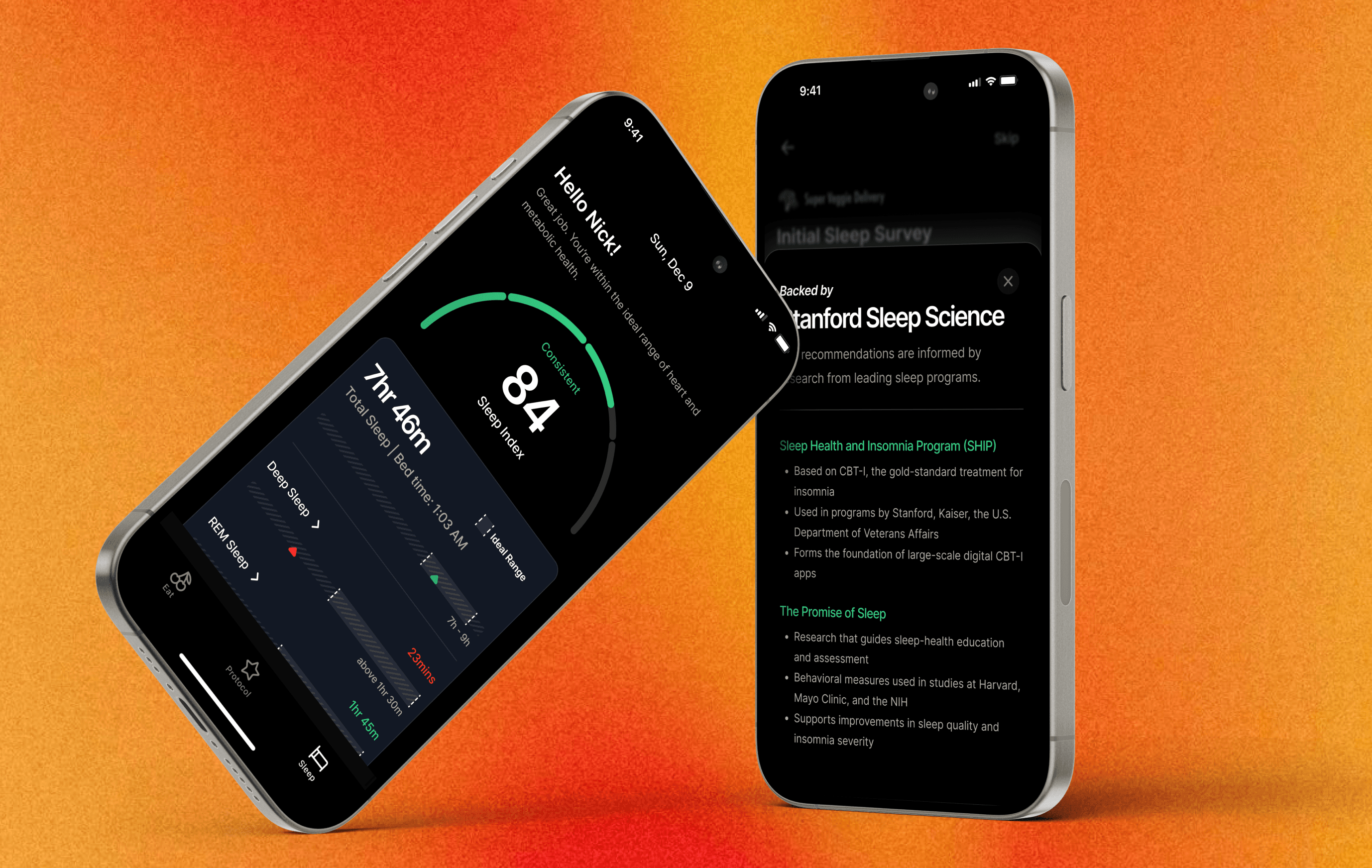
Sleep data was hard to interpret without context
The Sleep screen surfaced detailed metrics, but little guidance on what they meant or where to focus.
“Everything looks green. Does that mean I’m doing well?”
EXPLORED SOLUTION
Meaning before metrics
We layered in plain-language context to help users quickly understand what each metric represents, how they’re doing, and what to focus on.
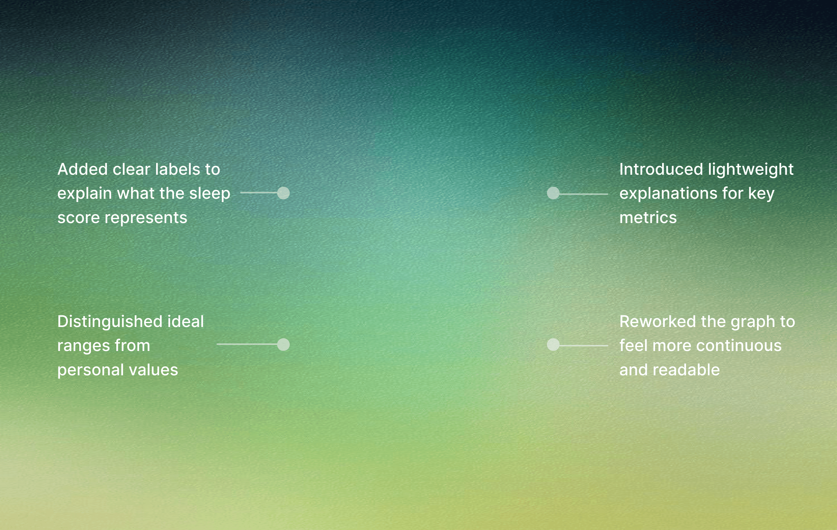
This shifted the experience from reading numbers to understanding personal progress.
PROBLEM 3
Sleep stages felt fragmented and unclear
The sleep stages graph felt visually disconnected, making it hard to understand the night as a whole.
“I’m not really sure how I’m supposed to read this graph.”

EXPLORED SOLUTION
Show sleep as a continuous story
We redesigned the sleep graph to feel more connected and chronological, helping users understand their night as a single flow rather than isolated segments.


Users could now quickly trace how their night unfolded instead of decoding isolated data points from the graph.
SECONDARY INSIGHTS
Removing friction from meal selection
While sleep was the primary focus, testing surfaced clear friction points in the meal-ordering flow that affected decision confidence and purchase momentum.
Hover or drag to compare
Showing price and nutrition upfront supported faster, more confident decisions.
DIRECTIONAL OUTCOMES
What’s shipping and why it matters
The recommendations from this study were approved by the Super Veggie team and are scheduled to ship in an upcoming release.
The changes focus on reducing cognitive load, improving decision confidence, and removing friction at key moments in both the sleep and meal flows.
Reduces early hesitation and dropout risk
Enables faster interpretation of data
Builds confidence during browsing
REFLECTION
Designing for momentum
Working on a feature that is moving toward production reinforced the importance of designing for momentum rather than completeness.
By validating where users slowed down, hesitated, or second-guessed themselves, we were able to recommend changes that prioritize flow, clarity, and confidence over explanation.
THANK YOU FOR READING!
Debodyuti Biswas